12-point Stag

First produced in 1887 by William Grant in Dufftown, Scotland, Glenfiddich— which means "Valley of the Deer" in Scottish Gaelic — is one of the most well-known single malt Scotch whisky brands in the world. (It helps that it's sold in every airport duty free store.) Independently-owned, Glenfiddich offers 12- to 18-year-old whiskies broadly and issues limited editions of up to 50 and 64 years old. This month, in order to further establish the premium standing of its product and standardize its presence, Glenfiddich introduced a new global identity designed by London-based Purple.
"Based on his antler points, the current stag is 8 years old, a young male within a herd. We wanted to turn him back into a royal stag — a majestic 12 pointer, which denotes the alpha male, masculinity, power, confidence and maturity. […] We re-drew the stag's face to make him more anatomically correct — the antlers were too small for his body and the face looked slightly feminine. We also wanted to elevate the icon's status — to ensure it wasn't recessive within the overall brand logo."
Provided press release / Gary Westlake, Founder and Creative Director of Purple
I had never paid much attention to the stag icon, it was just a quick association to make between animal of choice and whisky brand. It's one of those things that if it had stayed the same for the rest of time it would have been fine and bottles of the liquor would have still been sold but now, seeing the difference, it's unquestionably a much better rendition. The whole bit above about the age of the stag and the shape of the antlers is awesomely nerdy and it reflects very well on the new icon. The insistence on a gradient takes away from the simplicity but it's a subtle gradient, so we'll let it pass. The thinner wordmark looks a hair thinner, so no comments there.
We wanted to create a story-telling, bespoke font, which gives depth and authenticity — one that was distinctive yet uniquely Glenfiddich. We immediately looked to William Grant, Glenfiddich's founder, as the epitome of the brand's pioneering spirit. We also went through the company archives, looking at much of William's early correspondence from his key pioneering years, all written by hand. [hellip;] We approached two separate graphologists to get two different and objective opinions, giving them minimal information about the man (age, date, nationality) and told them very little about the project, to ensure we got the most objective analysis possible. […] "Based on the insights from our graphologists, we endeavored to capture William Grant's personality in a type. We created two bespoke fonts, for future use on all creative communications. One will only be used for headlines (and is clean and modern) while the other has more personality, and will be used for body copy. Both are uniquely ownable — and available to all markets for free."
Ibid
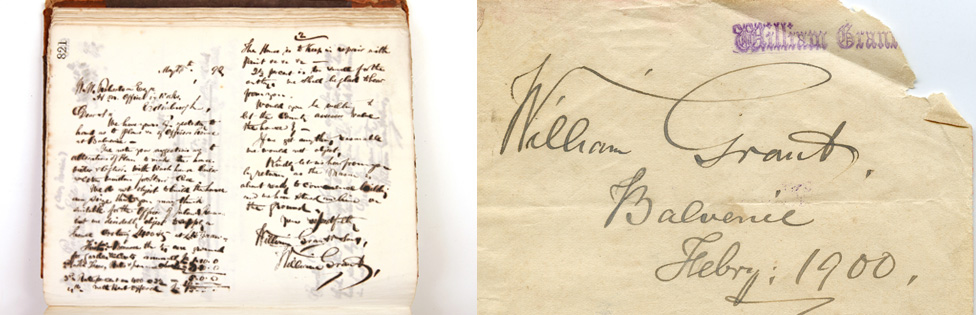 William Grant's writing.
 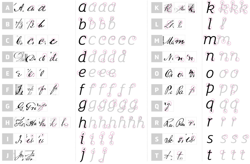 Analysis and development of Founder's Script.
 On Founder's Script
"Like William Grant, this serif typeface is completely individual. Inspired by analysis of his handwriting, it captures and embodies our founder's unique script characteristics and personality traits, like dynamism, imagination, innovation and confidence. We added unique letterforms to make the font more expressive and to bring out the character of the founder more. We also created a large range of ligatures to help add a handwritten script feel.
We've called it Founder's Script. It is friendly, human, storytelling, timeless, adds vitality and has a unique penmanship quality."
Ibid
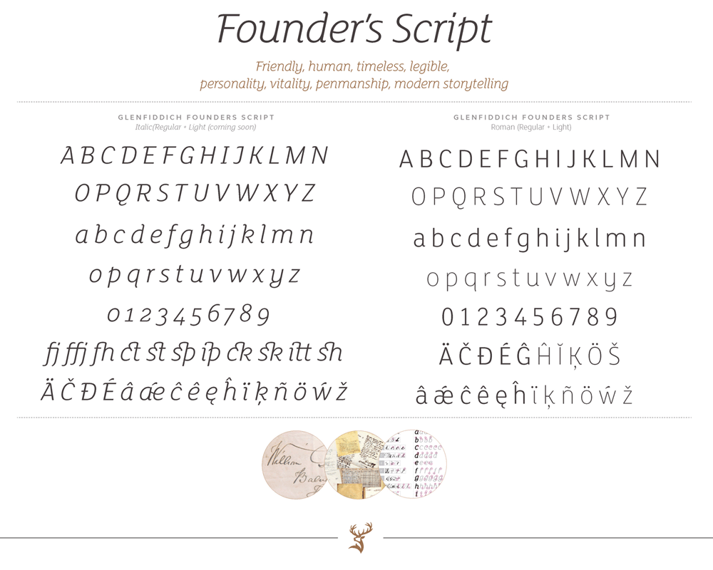 Founder's Script custom type.
 On Glenfiddich Modern
"A pioneering font fit for Glenfiddich now and into the future. Inspired by the Glenfiddich logotype, which has over 50 years of heritage, we've crafted a modern interpretation of its fine and sharp serifs and embodied it into a unique Sans Serif font. It is confident, clean, unique, premium and crafted. It has been inspired by the Glenfiddich logotype — using the recognizable serifs in a subtle way."
Ibid
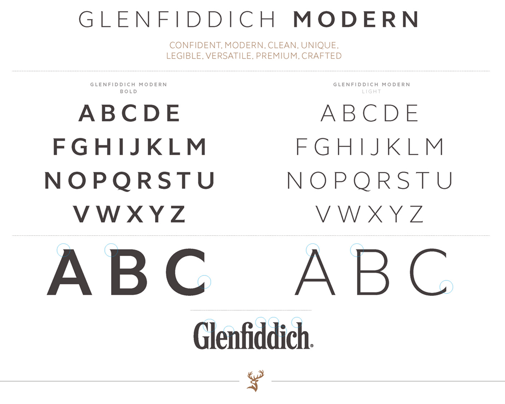 Glenfiddich Modern custom type.
 For all the thought and research that went into these two custom type families the results are rather underwhelming. Glenfiddich Modern looks like Gotham with flared serifs and Founder's Script is so far removed from the actual founder's script that you wonder why they even went through all the trouble. The latter is a little more ambitious than the first and does actually make a good job in giving the brand its own voice but the Modern… it's just kind of sad.
We chose a copper colour palette, which we called Pagoda Copper, inspired by the second-hand copper stills that William Grant bought in 1886, when he founded The Glenfiddich Distillery. We were also inspired by the constant care of their on-site coppersmiths, and the copper stag on the distillery's pagoda roof. Copper is ownable, distinctive and contemporary within the competitive set.
We also chose secondary colours of New Make White, which adds a fresh and contemporary feel, and Fiddich Stone, inspired by the slate and granite that was used on all of William Grant's original warehouses."
Ibid
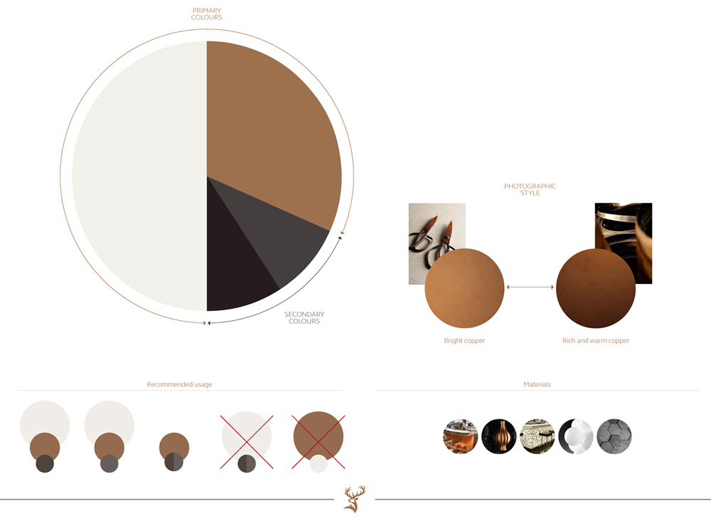 Color palette.
 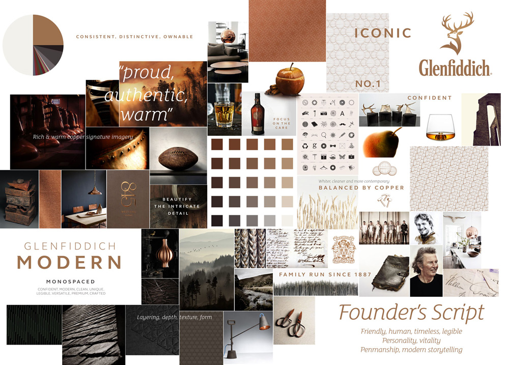 Moodboard.
 The color palette and moodboard are tasty as scotch, i.e., delicious.
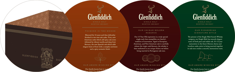
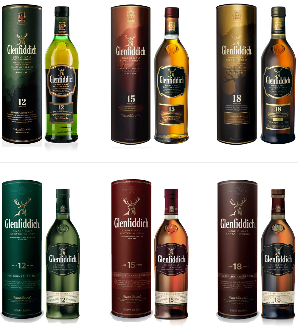 Almost before-after (top-bottom) comparison of bottles. The icon is still the old one, but the rest of the labels and graphics use the new language.
  Sexy shot.
 The new bottle remains mostly the same as it does have very strong equity. Now taking notice of the new stag icon, you can really see how well it stands out on a smaller scale.
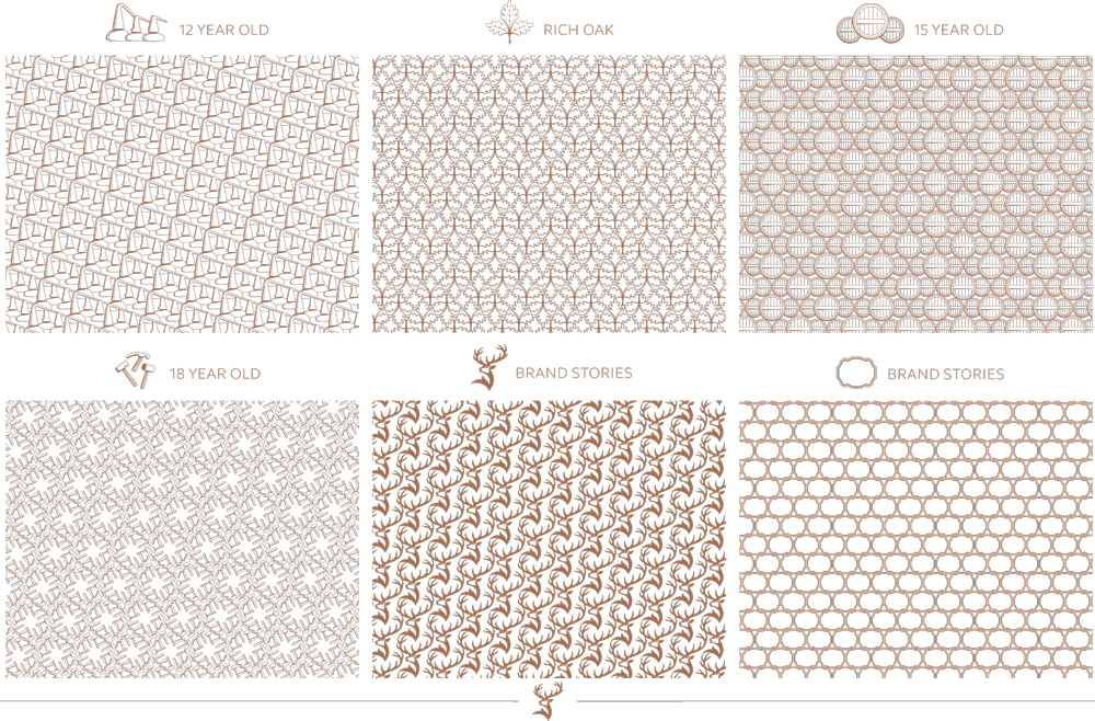
"Creating the graphic embellishments was a project within a project — we really liked the idea of creating a family of embellishments that captured the unique personalities of the brand, as well as individual single malt variants in the core range — from the 12 Year Old to the 21 Year Old. It gave us the opportunity to bring our family run idea and whisky stories to life."
The embellishments all highlight the unique features of each variant — whether the virgin oak of Rich Oak, or the unusually small stills used in the Glenfiddich 12 Year Old, which gives it a noticeably fresh and fruity flavour."
Ibid
 Embellishments.
 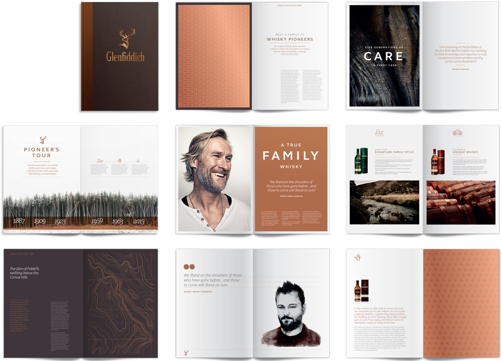 Print brochure prototype.
 The embellishments are an interesting secondary device. As patterns, some of them are quite stunning while others don't work so well, but it's a nice collection of items to have to play with.
Overall, this is a strong evolution that broadly considers all elements and how they play off each other. It's hard to make a premium brand more premium but it feels as if they have been able to do that successfully. It's not a groundbreaking design or evolution and the product basically sells itself but it's always interesting to see a subtle yet complex projects like this.
