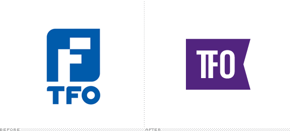
Originally launched in 1985 as La Chaîne Française, TFO (Télé-Française d'Ontario), as it was renamed in 1995, is a Canadian French-language educational and cultural public service television channel owned by the Government of Ontario. TFO has a dual focus on children programming as well as documentaries and other cultural programming for adults. The channel is now one component of the larger Groupe Média TFO, which produces web series and content for other partners. This February, TFO introduced a new identity designed by Toronto-based Lowe Roche.
Retaining the brand heritage while modernizing its feel, the new logo has taken on the shape of a flag to symbolize TFO's strong emotional connection with French-speaking Ontario. The visuals embrace a bold colour scheme that encompasses the corporate colour purple as well as red, blue and lime green. As TFO does not carry any commercials but does air self-promotion material, this bold spectrum was selected by Lowe Roche to help break up the visuals and identify TFO's diverse cultural content, which includes opera and ballet, arthouse films, social magazines and children's programming.
— Lowe Roche Press Release

Corporate and 25th anniversary logos in different color combinations.

The previous logo was far too corporate-looking for a channel that catered to both children and adults and didn't represent any kind of cultural bent. The new logo is still slightly ambiguous but the flag approach plays to a kind of national pride and it's in application that the identity gathers some indie, cultural flavor. But first, the logo execution: As simple as it seems and with so few elements you would think it would be hard to get something wrong but that "TF" ligature is very unnatural and forced creating a very narrow counterspace when they were trying to solve the wider counterspace generated by the "T". It's not terrible and it took me a couple of glances at the logo to notice it but, once you do, it's hard to keep your eyes off of it.
Summary of the complete identity.
The on-air package is what makes this identity work. The use of heavy rules and repeating of the flag to highlight important words give it a restrained edgy look and, more impressively, those same elements work to frame both the adult and children programming (you can see the latter at the 0:50 mark in the video above). The logo animates in a couple of different ways on screen, sometimes it has a confusing peeling-sticker effect and other times it waves as the flag it's meant to be. The peeling effect seems odd, but I guess it's an easy effect to pull off, more than waving. The rest of the applications support the on-air look and add up to a nice redesign.
Launch party for the new identity.
Thanks to Caspian Ievers for the tip.

Don't forget to cast your vote about this post online
