The Cider Knight Rules


Established in 1728 (not a typo), Aspall is a cider-making business that has been using the same orchards planted at Aspall Hall in Suffolk, UK to produce a range of ciders and cider vinegars. Owned by eight generations, it is one of the ten oldest family-owned brands in Britain. This past Summer, Aspall introduced a new identity and packaging designed by London-based NB Studio.
NB compiled a team of 'craftsman' to develop these assets — from woodcut illustrator Christopher Wormell who redrew the Aspall Knight, to writer Tom Lynham who helped tell product stories. Among the other newly commissioned elements were a series of botanical illustrations of apples by artist, Rosie Sanders. As one of the oldest British family businesses still in existence, the characters that have shaped the Aspall story now adorn the products in the form of portraits by illustrator Jürgen Willbarth.
The overall result is very sensitive to Aspall's history and heritage. The redesign emphasises the authenticity of the Aspall brand and products with robust underlying principles that create the platform for future cyder variants, the Aspall vinegar range and new products in both categories.
Provided press release
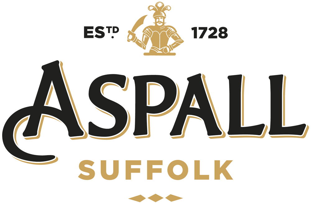
 Logo detail.
  Knight detail. Drawn by Christopher Wormell.
 Certainly this isn't a huge consumer product brand and I doubt many people have heard of Aspall but this is the kind of evolution projects that I really enjoy, when the basic elements are maintained and executed with better craft. I'm not a huge fan of the new logo per sé, it's not my style, but the before/after is undeniably a positive change with more interesting letterforms and a better use of space (or counterspace, that is, now that the gaping hole between the "A" and "s" is gone). The knight drawing is a great improvement with good detailing and a much more bad-ass moustache.
 Before and after comparison of bottles.
  Main bottles.
  Special bottles.
  Portraits of family members and business associates who have helped build the company. Drawn by Jürgen Willbarth.
  Label details.
 The labels also retain the basic structure but have better hierarchy and readability of all the elements. The single-color portraits soften the heavily antique look of the previous bottles but the bright primary colors used for color-coding the main ciders makes them feel a little Walmart-y. A more sophisticated color palette would have made the packaging air-tight. Perhaps some hues from the illustrations below would have helped…
 Botanical apple illustrations. Drawn by Rosie Sanders.
 Stationery.
 The stationery, with the gold foil knight, is quite nice and the illustrations are a yummy touch although I question whether they are needed at all — it feels like part of another identity project altogether. Overall, it's a fine improvement with great touches here and there and a couple of debatable decisions but it does make me want to scream "I drink your cider" (and your milkshake).
