Misty-eyed


(1999) "Sierra Mist is a lemon-lime flavored soft drink […] introduced by PepsiCo in 1999, replacing Slice and Storm, and eventually became available in all United States markets by 2003 and competed with The Coca-Cola Company's Sprite brand." (Wikipedia)
Design by: N/A
Opinion/Notes: Sierra Mist seems to change looks every three or five years and they usually end up with an edgy light look that hasn't managed yet to establish a clear aesthetic for it. This is the closest it's come to an integrated identity where there is a language built around the product. It's edgier than before but it's still fairly timid. Perhaps with the mountain-shaped "M" it's trying to appeal to the outdoorsy, X-games audience or it simply doesn't know what an "M" looks like. The logo is wobbly and inconsistent but at least it has more of a purpose. The packaging… no surprises there, it's just bubbles in the background. We get it, it's fizzy.
Related Links: AdAge story with plant of context
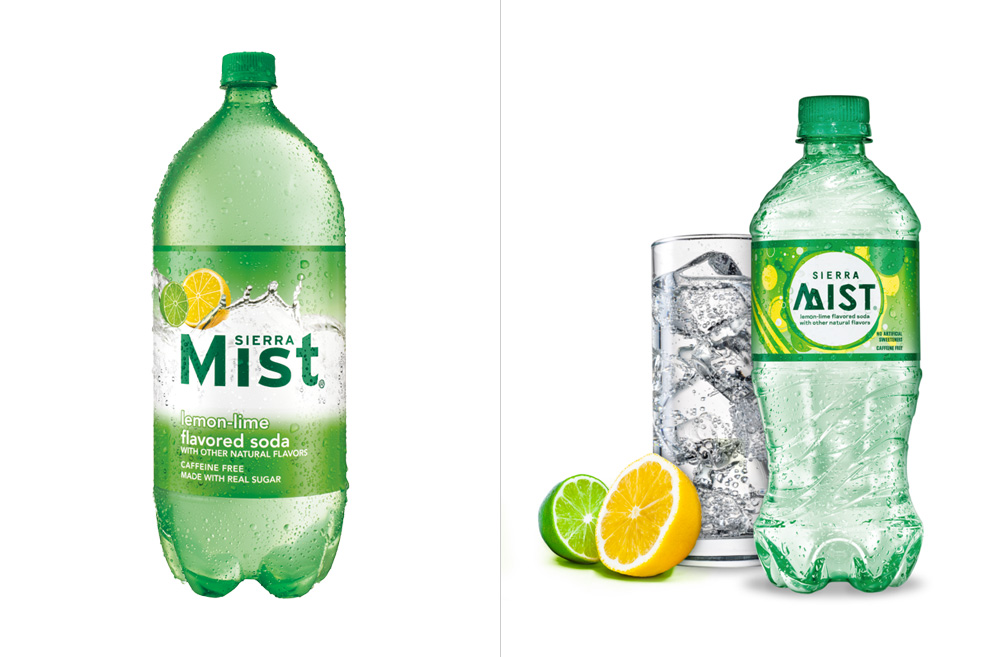 Another before/after comparison.
 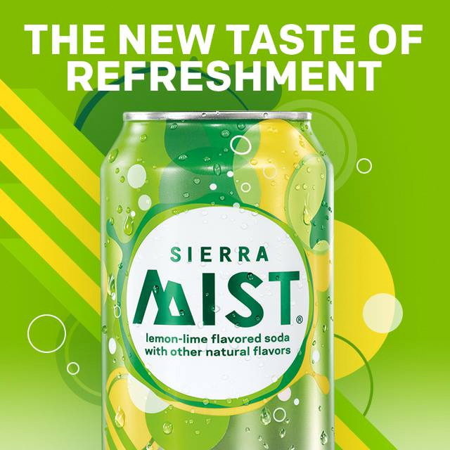 Logo and graphics.
  Different flavors.
  12-packs.
