Tile by Tile


Continuing my string of awkward introductions for destinations… Porto: it's in Portugal, it's the country's second largest city with a population of about 1.4 million, it's pretty as hell, a river runs through it, and has plenty of history. You can Wikipedia-it or Google-image-it, both options far more helpful than the preceding sentence. Earlier this month, the Câmara Municipal do Porto (Porto City Hall) introduced a new identity designed by local firm White Studio.
 Before and after of the logo for Porto City Hall, the organization behind the new design.
 Just to get it out of the way and put it officially on the record: old logo, yikes; new logo, yay.
For each citizen Porto represents a different thing. If you ask someone "What is your Porto?" the number of answers is endless. We felt like we needed to give each citizen their own Porto. We needed to show all the cities that exist in this one territory.
Thus it became clear to us that Porto needed to be much more than a single icon, much more than a single logo. It needed complexity. It needed life. It needed stories. It needed personality.
Behance project page
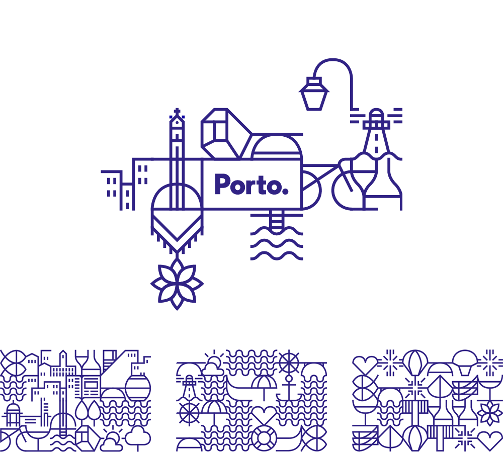
 Logo detail.
  Various logos stemming from the new system.
 Looking at Porto from an aesthetic point of view we found the inspiration we were looking for in the blue tiles spread all across the city. […] Inspired by the stories in the tiles we developed more than seventy geometric icons that represented the city and its people. The icons were designed based on a grid that could connect them with each other, creating a continuous network that evokes a tile panel. These icons became a visual code to represent the city. A code that can live by itself, viewing each symbol individually, or as a network of symbols that show the never-ending complexity of our city. The icons could also be more illustrative, telling stories, showing the landscape, translating our passions.
Behance project page
 Logo with pattern and various patterns.
 Even I am starting to get tired of hearing myself say this but damn if I don't like a good, smart pattern system. Inspired by the city's vast inventory of blue tile, the new identity is built around a cadre of Porto-specific graphic references that can be combined in endless ways both in terms of icon combination and pattern structure. The resulting patterns are highly attractive and generate beautiful textures in signs around the city. Anchoring the patterns is a simple, geometric sans serif wordmark that fits today's, well, geometric sans serif wordmark trend. It's not the most adventurous or innovative approach but it works and, in particular, it works well with the complexity of the patterns.
 Tile wall unveiled during launch.
  Signage aplenty.
 Window display.
  Wrap for Metro do Porto.
 It could be argued that this multi icon, flexible approach is the easy way out, giving everyone something they associate with the city as opposed to trying to rally them around a single icon or a more standardized solution. I don't think it is, btw, but it's worth being my own devil's advocate every now and then. In this case the blue tile concept and its ties to the city make this a perfectly reasoned approach and it's been ambitiously crafted and deployed throughout the city.
