The Chicago Wiggle


Given the positive reception of last year's post about the design and development of the 2013 Brand New Conference identity I thought you fine people would enjoy another thorough overview of what we did for this year's conference in Chicago, IL. We enjoyed doing it, so I think you will enjoy seeing it.
Logo
The concept behind the logo is explained in detail here but for the benefit of this post I will quickly summarize the ingredients that played into its execution:
Using the two Chicago versions and mixing in the weird influences mentioned above we built a modular logo that could have multiple configurations.
Color Palette
No surprises or big thinking here: five shades of gray and red, taken from the CHICAGO musical posters. It looks cool, so why fight it?
Typography
Because at the end of the day the Chicago fonts are not really the most pleasant typefaces in the world we needed a supporting typeface that would do most of the heavy lifting for all the text that we wanted people to, you know, read. Monotype had just released Burlingame by Carl Crossgrove when we started working on this so we jumped on it for its rugged yet quirky personality. We used the Condensed version for headlines, and regular (all caps faked as small caps) for subheadlines.

Speaker Names
Despite knowing how time-consuming it would be to typeset the name of 21 speakers in the two Chicagos and the wiggles it's something we knew we just had to do. So we did.
 21 speaker names.
  Patterns in gray color palette for each speaker.
 Once we had the names and patterns we could use those for stage slides for each speaker, building in the color palette and typography and starting to develop the system.
 Speaker slides shown during the conference.
 Tote Bag
The first element we tackled this year was the tote bag. We had the cool pattern and knew that we wanted to do a full coverage fabric instead of the usual small print area that most vendors allow for silkscreening. So we went to the source and had fabric silkscreened first and then turned into a tote bag. Yes, it was expensive (printing 5 spot colors will do that to ya): $8 per bag instead of the more typical $3 or $4 you would pay. To help us make this tote bag a reality we tapped our long-time supporter, MailChimp, for some additional financial support which they did and that's why there is a chimp on the bag. (And because there is not enough chimps on stuff). The red shoulder strap also brought an extra oomph, while the gusset of the bag (the sides) are black for a respite from the pattern.


 Tote bag. (Open any image in new tab/window to see bigger).

 The tote bags in action during the event. Photos by Drew Rios.
 Badges
Our initial idea of doing a thick rubber badge was scraped because industrial rubber stinks. So, as they say, we pivoted and went with a layered approach, using Neenah's PLIKE paper which has a rubbery feel that made us feel better about foregoing the initial idea. The trick with badges is that whatever we did once, we would have to do 800 times over so in hindsight this multi-step, multi-piece badge was probably the worst approach but they turned out cool. Each badge consists of a red piece of PLIKE bound with a piece of custom tape to a white piece of PLIKE where we printed each attendee's name and then trimmed with a "wiggler"; that lays on top of a gray piece of paper with the schedule for day one and has another piece of custom tape at the bottom; this one lays on top of a last sheet of black PLIKE with the schedule for day two. All those pieces of paper have to be punch-holed and placed on a string. So, yeah, that was a lot of work.
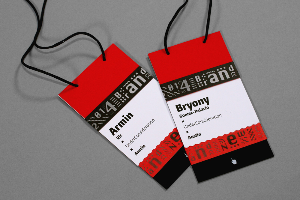
 Badges.

 All the different layers. The schedules are "upside down" because when the badge hangs from your neck and you flip through the layers, the schedules are the right orientation for a quick read.

 The badges in action during the event. Photos by Drew Rios.
  The initial steps to creating the badges included building a guillotine to cut string in yard-long pieces, burning the edges of the string so that it wouldn't unravel, layering all the elements, and sorting alphabetically.
  Our volunteers placing the final element: the strips.
 Program
Based on the layered and PLIKE-d approach of the badges we did the program in a similar fashion, with a half cover in red and a full cover in black PLIKE. The black cover was gloss-varnished with the pattern and then the red cover was completed by hand-placing a strip of branded tape that completed the sentence "2014 Brand New Conference". These strips could be placed anywhere on the cover and they would always be readable. Our volunteers placed all 800 pieces of tape on the day before the event. Close call? You betcha!


 Program covers with hand-assembled tape.
  A straight-up shot of the program. Photo by Drew Rios.
  Our volunteers placing the final element, again: the strips.


 The inside of the program. One of my favorite details is the texture on the edges of the book (last image) from bleeding the speaker name patterns. (Open any image in new tab/window to see bigger).
 T-shirt
We kept the t-shirt dead simple: It just says Chicago, set in Chicago. Figuring that post-event it becomes a design-nerd t-shirt for those in the know. The logo is printed on the sleeve as well.


 T-shirt.

 A stack of attendee t-shirts and our volunteers with their own STAFF shirt.
 Podium
We printed the pattern on a 53-by-72-inch piece of this thing called "Suave Super Smooth 13oz Indoor Banner" which is a plastic-y material that bends and folds very nicely and then we wrapped the venue's existing podium like a gift.
 Podium.
  Bryony, podium, and Mario.
  Podium detail.
  Yeah, high five, babe!
  Bryony with supervision from the venue's stagehands wrapping the podium.
 Scenery
One of the last things we worked on was scenery. We realized the stage was huge and that it was going to feel a little desolate out there without anything on it. Our first idea of cobbling together "pixel" letters from cardboard boxes was shut down by the venue because they are a fire hazard. So, again, we pivoted! (I just love using that word). We had some yellow plexiglass left from last year's badges and decided to give that material a try and generate laser-cut letters out of it. The first test was successful and we ordered giant sheets of red plexi to have laser-cut at MakeATX. Check out the file we sent to laser-cut to make sure we bought the least amount of plexi.
Once cut we put basic Home Depot brackets behind the letters and fastened them with tape. Then the fun began: kerning the letters in real life by hover-art-directing three of the venue's stagehands as we weren't allowed to touch anything that went on the stage. Union rules. They sure learned their lesson. Probably went home and told their significant others, "You are not going to believe what I had to do today at work".
 Setting up the letters for kerning.
  A long shot of the first pass. (Oh, yeah, we were messing with the kerning until the morning of the event). Photo by Drew Rios.
 These letters were probably the best part of the whole identity, they really signaled that this was our conference and for at least two days, this was our — attendees, speakers, volunteers, and us — house.


 The letters in action during the event. Photos by Drew Rios.
 They also made for great framing devices to shoot speakers through.


 The letters in action during the event. Photos by Drew Rios.
  Our view for most of the two days. Early morning shot as the auditorium filled in. Photo by Drew Rios.
 In Summary
Hopefully, as you can tell, we really enjoy doing this because we know people enjoy it and appreciate the attention to detail and handiwork touches that make all these things a little more lively and human. When we start out with the logo in February or March we have no idea where we are going to end up, there is no master plan for the identity nor do we set a course for how things will come together, we just go element by element and start to build consistency and string ideas together as we go along with one thing influencing the next. It might not be the ideal workflow but we like this process that allows us to improvise (or freak out) as needed. We have a few months to not think about this so that we can start freaking out about what in the hell we'll do for 2015.
