Of Women and Men


Launched this past September at an event in the United Nations (UN) headquarters, HeForShe is the "UN Women's Solidarity Movement for Gender Equality bringing together one half of humanity in support of the other half of humanity, for the benefit of all." The movement and campaign hinge on the premise that gender equality is not just a women's issue but a human rights issue that requires participation from both women and men. The HeForShe campaign was brought to the forefront thanks to a heartfelt speech from Emma Watson that clearly emphasized the need for both genders to work together. The logo and identity for the movement has been designed by New York, NY-based DIA.
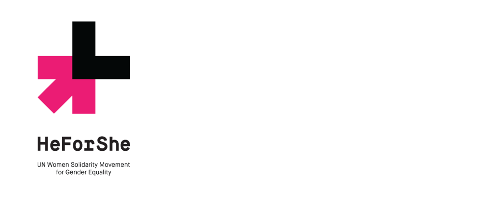
The HeForShe logo mark represents this solidarity movement by joining together aspects of both the female and male symbols. This union symbolizes women and men working together to make gender equality a reality. This mark does not favor the male or female symbol, but blends them together creating a new symbol for humanity and gender equality.
DIA project page
 Logo detail.
 The icon picks up pieces from the male and female gender symbols to form a new icon making it identifiable with the cause but without being overly prescriptive or literal about it. The implied cross formed by the two shapes also gives it a sense of urgency and of something that needs to be fixed. At times I want to read the black shape as an "L" and I wish there was a better integration between the two contrasting shapes, as opposed to just one on top of the other, in order to convey the need for unity a little better. It's hard to predict yet whether this icon will rise to the prominence of other cause icons — whether it's the AIDS ribbon or even the peace symbol originally meant to represent a weapons disarmament movement — but it clearly has the potential in its simplicity.
The wordmark is fantastically ambiguous and it really manages to capture a neutrality that makes it neither masculine nor feminine, yet it's really both. And the color palette is both stark and vibrant… I could see both me or my wife wearing the exact same HeForShe t-shirt in this color palette with equal comfort and conviction.
Overall, the identity communicates with shared masculine and feminine sensibilities. The typography is bold, but thoughtful while the colors are powerful, warm and energetic.
DIA project page
 Stationery.
  Business card.
  Brochure cover.
  Sample editorial spreads.
  Scarf.
 Posters.
  United Nations special event ticket.
  Emma Watson delivering her speech on September 20, 2014. Watch the video here.
  Other guests at the event.
  Pins.
Pins. In application, the two colors — three with white — work so well together and provide an infinite range of combinations where each color can become dominant or complementary and still stay on brand, while the icon can become the center of attention, literally, or serve as a signature, or take over as a pattern. It's enjoyably flexible — and gender equal! Overall, this is a solid and thoughtful launch that really serves the message.
