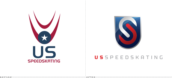
US Speedskating is a non-profit organization that serves as the governing body for the sport of speedskating in the United States and responsible for getting athletes to the Winter Olympic Games. The US Speedskating team has won an impressive 85 Olympic medals. Last year they introduced a new identity and uniforms designed by Salk Lake City, UT-based Struck.
"We created a bold new look that meets a complex set of needs in a simple, graphic way," said Struck Design Director Tosh Brown. "The mark incorporates the long and short tracks, the "U S S" letterforms, and the skating oval. The logo looks forward without neglecting the tradition of the sport, and speaks to the speed and grace of the athletes and the patriotism of the fans."
"Entering a new Olympic quadrennium brings the opportunity to break out in a new direction," said US Speedskating Executive Director and two-time Olympian Mark Greenwald. "Our brand is about world class performance. Struck, along with our marketing staff and a team focused individuals, worked together to articulate and elevate our brand, helping to place a new face on the organization and our new direction. The new logo incorporates a great many aspects of our sport, including the turns of a skating oval, and the "S" for Speedskating, but I like to think of the "S" image on the shield standing for success."

Long and short track logo versions.
The old logo, with those superduperextrafast-looking swooshes seemed more appropriate for the US Bobsled team and the typography was anything but stellar — nonetheless it was a decent, USA-ish logo. The new one is much more focused on representing the actual sport with allusions to the oval in which it takes place and, still, some subtle swoosh shading to denote speed. The shield is a clever way of doing a "U" and the interlocking "S" provides a couple of ways of reading two "S"s in it — although initially I found it a little confusing as to why they are interlocking, almost makes me think of rollerblading when team members lock elbows to throw one of them for extra speed. I digress. The logo is as USA-ish as it gets, so that's always a good thing for American Olympic teams. The typography is a very nice evolution from the previous one, looking contemporary and sleek.


The uniforms look pretty cool in deep dark blue and the secondary "USA" logo is a nice extension of the brand although, if we are being sticklers, it reads as "USSA" given that that's what it's doing in the shield logo. Overall, a positive redesign.


Don't forget to cast your vote about this post online
