Full of Hot Air and Awesomeness

Launched this August, Blloon is a new ebook service for tablets and smartphones (only iOS for now) offering over one million book titles available for consuming; starting with a free plan to hook you in with 1,000 free pages building up to paid plans measured in page count: 500 pages a month or 1,000 pages a month for £3.99 and £6.99, respectively. Based in Germany, the company just launched the app in the UK but will expand to other parts of Europe and eventually the U.S.. Blloon's identity has been designed by Berlin-based EdenSpiekermann.
Once the discovery phase was complete, we set about defining the three brand pillars: Easy (removing the barriers between people and stories), Honest (subscribe to great stories, not fine print) and, most importantly, Magical. We boiled this down into a single brand core statement: "Blloon is my smart escape to all the great stories".
The next step was to visualise this value proposition. How? Well, in order to escape the real world, we needed to create a way to take our users there. A way that would take them to places they've never seen before.
In short, a magical way to escape — Blloon.
EdenSpiekermann project page
 Sketches of various machines.
 We imagined Blloon as a vehicle to this world of stories, and started out by researching the most spectacular (and often impossible) vehicles and flying machines in both history and fiction. Our project room soon started to resemble a mad inventor's laboratory with the walls covered in images of Leonardo flying machine drawings, illustrations from Jules Verne, zeppelins, Victorian air balloons, submarines and pretty much everything in between. After narrowing down our selection to a flying chair, a submarine and a spaceship we landed upon a strange looking balloon with a odd propellor at the front — there was no doubt this would be the logo. Interestingly the brand mark came a long time before we had the name. Working with a colleague in the Netherlands, we created a name that felt strange, and familiar at the same time. When pitching the name to the client the rationale was simple: "It's a balloon without the 'A'".
Paul Woods, EdenSpiekermann Design Director
Although I'm not a fan of the Flickr naming convention where vowels are removed gratuitously (while allowing for extra trademark-ability) there is something very charming about Blloon, sounding almost like a toddler would say it, happy as a puppy (until, that is, the blloon slips from his or her hand, flies into the sky, and damage control begins). It also helps that the wordmark is not set in a rounded sans serif in neon colors but a generously tracked serif that gives it an appropriate literary aesthetic. But the main attraction is the quirky blloon itself that has been chosen as the icon: it's like an ice cream cart with a propeller and a Charlie-Brown-decaled balloon envelope (the official name of the balloon-ey part).
The resulting logo is charming, unexpected, and distinctive. Plus, it has some cool balloon friends:
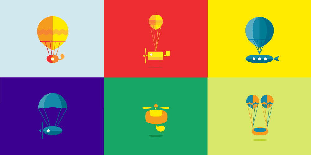 Secondary range of "magic vehicles".
  Typography. Both available from Klim Type Foundry.
  A few applications.
 User interface samples.
 In application, Blloon is presented boldly with vibrant colors and a loud sans serif that provides messaging and other cues for attention. At times, the super bold, super big use feels like part of another identity altogether, but is still nice to look at. Judging from the UI samples available, the app looks smooth and crisp, with an overall sense of playfulness worth taking for a ride.
