Ray of Light

Set to open in 2015, the Louvre Abu Dhabi is, as its name implies, an extension of the Louvre in Paris to be deployed in Saadiyat Island, a mixed commercial, residential, cultural, and leisure development half a kilometer off the coast of Abu Dhabi. Designed by Ateliers Jean Nouvel, the museum will "present major objects from the fields of archaeology, fine arts and decorative arts. It will also represent all regions, periods, including contemporary art and the narrative of art history," and will "reflect the region's role as a crossroads for civilisation". The logo for the museum has been designed by Paris-based Studio Philippe Apeloig.
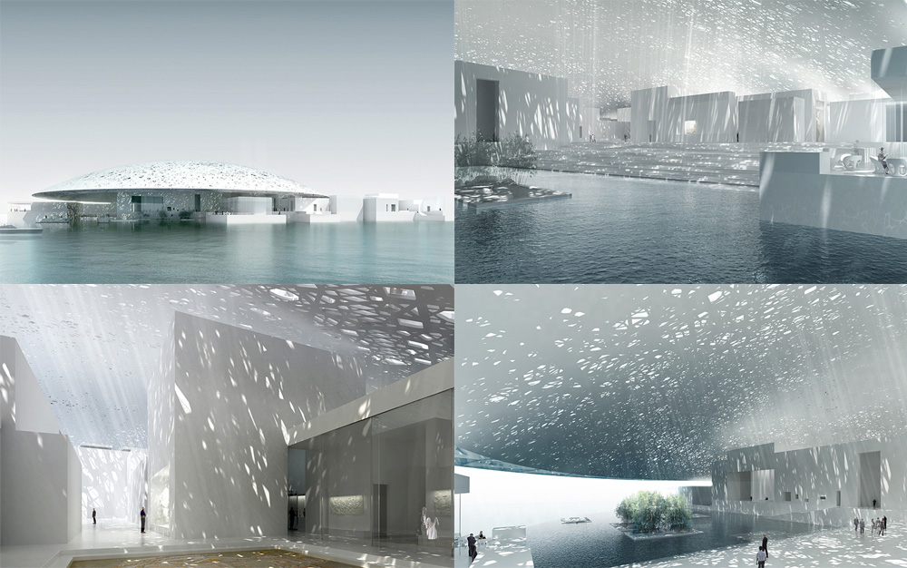 Building renderings. More here.
 The first step was to identify what typeface to use. One of the most important considerations was the historical and global reach of the LAD collection, which represents many different civilizations. Ultimately, I decided upon a new version of the Frutiger latin font, a typographic masterpiece that symbolizes modernity. The new rendition, an original redesign by Adrian Frutiger himself, is called 'Frutiger LT Pro'. It was intended to be used for signage and has specific qualities for this. Frutiger also added a number of international glyphs that are very helpful when you have to deal with many different languages.
For the Arabic typeface, which became part of the logo we needed another solution. I imagined one based on Garamond, a Latin font that epitomizes typographic history. I wanted a new font that echoed the harmonious shapes and counter-shapes of garamond, but with the rhythmic gestures, ligatures, and wave-like qualities of arabic script. I asked a young lebanese typographer, Kristyan Sarkis, to develop an exclusive type family for the project. His solution was 'LAD arabic' a typeface derived from another of his designs, Colvert. Kristyan developed three variants of LAD arabic for use with the identity and signage.
Designboom interview with Philippe Apeloig
 Custom Arabic typeface, LAD Arabic, by Kristyan Sarkis.
 For the logo I chose to symbolize the building's spiritual dimension and to recreate its very particular micro-system and climate. The challenge was to evoke the mysterious whiteness and lightness of this exceptional space, and to take into account the area's extreme heat. The flat outline of the design alludes abstractly to the horizontality of the architecture, echoed and reinforced by the waterline. a thick, straight line perforated with hatchwork creates a series of hyphens of different widths that scatter in different directions, embodying not only the dynamic link between world cultures but illustrating and giving form to the kinetic effects of light. This concept, in turn, provided the foundation for the pictographic system. the logo consists not only of the broken line but a line of arabic script. The two are meant to be read non-hierarchically.
Designboom interview with Philippe Apeloig
There is no identity or application yet to review but I found the logo interesting enough on its own to warrant a review and discussion. Its sparsity and ambiguity are off-putting at first and it wasn't until I read the full interview linked above that I began to appreciate the subtleness — nonetheless, I'm not a full believer in the solution. My main problem is that I keep trying to find letters, perhaps the acronym LAD, in the white lines streaming down from the thick, black bar and even with the exposed grid above, there doesn't seem to be a clear meaning behind their angles and positioning. Perhaps a nod to the Paris museum's pyramid structure? The line is meant to represent the waterline and I would have guessed it would represent the dome, since it sits on top of the typography and is supposed to be letting in rays of light like the dome. And the detailed, latice-like rays of light let in by the dome, here are depicted as hard spotlights. So, it's confusing.
Once you see the thick line as a collection of hyphens I think it becomes more interesting, particularly in the horizontal version of the logo, connecting East and West and the potential for an interesting identity is very promising. Although I'm not a huge Frutiger fan — the font not the man — the neutrality of it lends itself well to the spectrum of proponents for whom a museum is a blank canvas. I also found it interesting that even though an Arabic version of the name would be enough contrast, Apeloig chose to make it even more contrasting by using a serif style. Overall it's an intriguing logo; it requires too much explanation and even with the explanation it's not entirely convincing but there is a deadpan allure to it that is hard to explain.
