Royal Ligatures

Incorporated in India in 1955, Royal Enfield is a motorcycle company with a history that dates back to the 1890s and has its roots in the town of Redditch in the UK. After the Indian government ordered hundreds of Royal Enfield's bikes for its police, an assembly plant was established in India building bikes from parts shipped from England, and later it bought the tooling to manufacture them locally. The British Royal Enfield company closed in the early 1970s but the India company, being independent and quite popular, continued producing bikes under the brand name and now sell them in over twenty countries. This past May, Royal Enfield introduced an evolution to its logo and new identity designed by Gurgaon, India-based Codesign.
One of the areas that needed a deeper understanding at the commencement of visual identity, was the quality and character of craftsmanship that the brand genuinely owned. This was critical as it guided decisions at both strategic and drawing-board levels for the visual identity.
One of the key insights, that the brand's view craftsmanship is human, led to the overall identity family's openness in embracing diversity and quirks. The resultant family of assets, was not oversimplified or brought under a strictly uniform mould. Instead, a consistency of richness and restraint, of beautiful functionality and purposeful craft, binds it together.
Provided text
The new Royal Enfield logotype is an evolutionary step forward from its predecessor, inspired by the commanding presence of the design of the motorcycles, and drawn for higher recall and finer translation into both 2D & 3D renditions. From the selection of a drawing direction that best represented the enduring legacy of the brand, close to 100 iterations of detailed drawing variations were created and refined to arrive at the final form, taking into account the nuances of provenance, power and craftsmanship.
Provided text
The old logo was okay; even with its vintage patina it's not as cool as other early twentieth-century marks. The new wordmark is a playful evolution that retains some of the characteristics of the original but certainly attempts to establish an aesthetic of its own. There are aspects of it I like: the "Ro" ligature is successful and the flared serifs are elegant. Other aspects I don't like as much: The "En" pair is a little wobbly. As a whole, though, it's an attractive piece of lettering.

 Logo on bikes.
 And, let's face it, the new wordmark could be set in Comic Sans and it would still look awesome if applied on bikes like the above.
 Old crest and seal.
 The Seal represents the brand in a pithy visual nutshell, through a stronger drawing of the letter R, with a dual graphic of the letter E and wings, signifying the liberating exhilaration of the riding experience.
The Royal Enfield crest dates back to its origins in weapons manufacturing, reflected in the unit comprising of a canon and the motto "Made like a Gun". Moving forward, the new design weaves all the elements into a firm composition around the central powerful illustration of the gun, into a seal of pride that celebrates its provenance.
Provided text
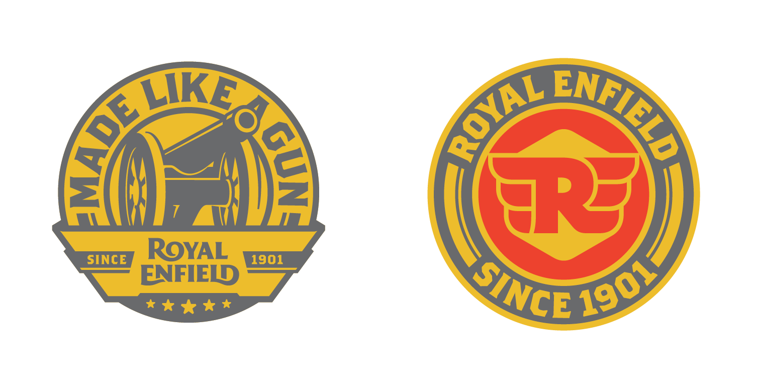 New crest and seal.
 In the new crest and seal, things start to get a little strange. The introduction of Emigre's Brothers brings and unfortunate cartoon-y look that takes away the genuine hand-crafted approach of the main wordmark. It's not that Brothers is a bad typeface — it's one of my favorite — but it's been used so much to convey vintage and rough that it's become a cliché. The bubbly drawing of the "R" and wings feels out of place with the wordmark and even the bikes, while the cannon in the crest is too illustrative and seems like part of somebody else's identity.
 Seal in use.
  Crest on bike.
 In application, both elements are salvaged through cool applications but the visual language does feel a little off.
The hand-drawn dual stripe on the tank of the iconic Bullet model from Royal Enfield is a living testament to its crafted approach to design. During the project, we identified and recreated this iconic element as a supporting graphic asset to be used across the entire brand spectrum with flexibility and malleability.
Provided text
Video of a guy with mad skills painting the dual stripe by hand on a tank. Store facade.
 Overall, based on the main wordmark, this is a redesign with great potential as long as they don't try to Harley-Davidson-ize it. Not a knock on H-D, I love H-D as well, but it feels like Royal Enfield is trying to introduce various design elements a la H-D but without the same organic evolution. In the end — and this is coming from someone who couldn't care any less about bikes — these are extremely handsome bikes and the identity design takes second place to their design.
