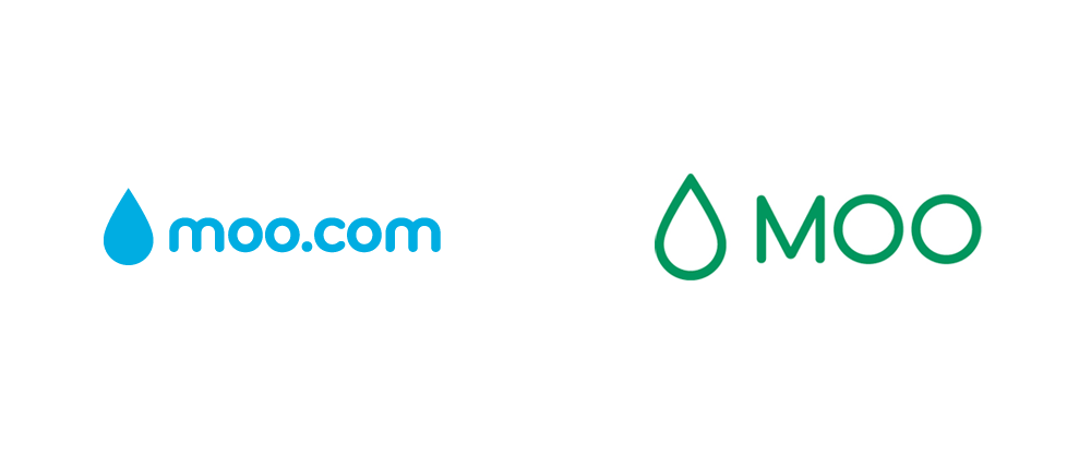
The Cows Still ain't Coming Home


(Est. 2006) "MOO is an online printing company, creating beautiful products from your own photos or designs. We print with your photos stored on Facebook, Flickr, or SmugMug, or you can upload your images to MOO directly. MOO also works with some great designers, so if you wanted to make something different and personal, have a browse around — see what takes your fancy."
Disclaimer: MOO is a presenting sponsor of the 2014 Brand New Conference. This post was not requested by MOO nor part of any deal. MOO is a well-known company and they recently announced the logo change, so that's why it's on Brand New.
Design by: In-house
Opinion/Notes: Did you know that MOO was originally named Pleasure Cards? MOO founder, Richard Moross, explains in this video that he named it that because Pleasure is the opposite of Business, as in when you are flying, so the opposite of a business card is a pleasure card. Good logic, terrible name. I've always been intrigued by the choice of MOO, and other than it sounding funny there is no real reason given. I'm still also waiting for them to graphically acknowledge this cow-ness somehow in the logo. They don't have to go all Chick-Fil-A but something, anything. Instead, they've been relying on a drop of ink for their logo for many years now. It's a safe concept that makes sense and this latest iteration is probably the most refined. While their promos and products are top notch, there seems to be an extra big oomph missing from their identity.
Related Links: MOO blog post
Select Quote: Of course we still love to print, I mean we really_love_to_print. We heart it, big time. But we like other things too and, as we work to bring our look and feel up-to-date, our logo, fonts and colour palette all being refreshed, we thought we'd have a crack at updating our tagline as well. Today I'm proud to reveal our updated brand identity and new tagline, "Design works wonders". With the tagline we wanted something that stayed true to our values, but broadened our horizons beyond print. MOO has always been about more than that and we wanted our brand to say so explicitly.
Our logo has been simplified, but we wanted to keep the memorable and iconic ink drop that makes MOO so familiar. Our colour palette has expanded significantly, but still feels very MOO-y, and our fonts have been subtly ‘tszujjed' to feel a little more grown up, because we are.
 And older logo that is probably the most known.
  New logo with tagline.
Newest Moo promo. (New logo can be seen on the can of paint).
An older promo (with the old logo) but still one of my favorite pieces of promotion for the design industry.