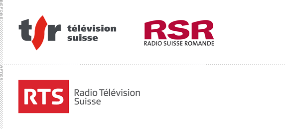
Established in 1931 SRG SSR is the Swiss public broadcasting responsible for overseeing the public service broadcast in radio, television, and online in all four official languages of Switzerland (German, French, Italian, and Romansh). Its French broadcaster, originally two separate entities — Radio Suisse Somande (RSR) and Télévision Suisse Romande (TSR) — have just merged into a single entity, Radio Télévision Suisse (RTS), and have introduced a new family of logos for its different channels across mediums, designed in-house.


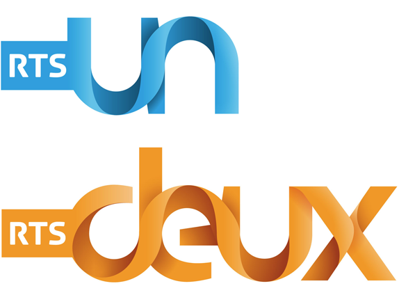
The TV channels: RTS Un, RTS Deux.
The more flamboyant logos in this identity package are the TV channels, which use a ribbon-esque construction that makes absolutely no physical sense as it relates to typography. The twists and turns may be pretty (relatively speaking) but they are annoyingly gratuitous as not a single strand of ribbon resolves in either an interesting manner or into something typographically clever. The animations shown below sort of help hide the poor construction and manage to establish the twisty look they couldn't quite pull off statically in the logo.
Two sets of videos covering the overall on-air look.
The rest of the identity is mostly an exercise in deploying the new "RTS" tag. The radio channels keep their original logos but now have the tag integrated — if anything was up for a major overhaul it was these four logos, each more strangely executed than the next. The web channels are the most straightforward manifestations of the logo, making you pine for some restraint and simplicity in the rest of the family.
Overall, this identity screams "change!" but at a slightly obnoxious pitch.

The radio channels: La 1ère (for news), Espace2 (for culture), Couleur3 (for music), Option Musique (for more music).

The web channels: RTS.ch, RTS Info, RTS Sports.
Thanks to Thomas Dagonnier for the tip.

Don't forget to cast your vote about this post online
