Love is in the Air

Established in 1971, Southwest Airlines is one of the most liked and well-regarded airlines in the U.S., from its low-cost options to uproariously and authentically funny and chillaxed flight attendants — although the effect can sometimes be grating. Southwest travels to 93 destinations in 40 states, operating more than 3,600 flights a day, transporting more than 100 million customers a year with the help of 45,000 employees. While other airlines have suffered bankruptcies and layoffs, Southwest has remained profitable for 41 consecutive years. With expansion to big-market destinations like New York and Washington, D.C., and other growing plans, Southwest introduced yesterday a new logo, identity, and livery designed by New York, NY-based Lippincott. (Additionally, Southwest has gone the extra mile by crediting all its creative partners: GSD&M, VML, Razorfish, and Camelot Communications).
"Our collective heartbeat is stronger and healthier than ever, and that's because of the warmth, the compassion, and the smiles of our People," said Gary Kelly, Southwest Airlines Chairman, President, and Chief Executive Officer. "The Heart emblazoned on our aircraft, and within our new look, symbolizes our commitment that we'll remain true to our core values as we set our sights on the future."
Southwest press release
I had never really acknowledged that the old logo was, in fact, a plane with the livery and the name of the airline under it. Fantastically lame, no? It's as if Apple's logo were a picture of the iPhone and the word Apple underneath. Moving away from this overly literal approach, Southwest has adopted a heart as its icon and main identifier. And it's so great. No other airline has a heart — either as their logo or as in having any empathy to how shitty the coach-flying experience has become — so they automatically stand out. It's one of the boldest airline logo changes we've seen, even more so than American Airlines which simply went with an updated eagle icon. This heart icon makes a grand statement that only Southwest can make. Its execution is also on target: it's not a sentimental or cloying or child-like heart but cast more like a pin that anyone (man, woman, or child) would gladly wear on their shirt. The sizing of the logo is also key. It's small and serves like punctuation so it's not a "LOOK AT ME" kind of icon. It's there to accompany the rather nice wordmark that is refreshingly contemporary, well kerned, and has enough personality of its own to be recognizable. My only minor complaint would be the "u" — I just don't like all these stem-less "u"s out in the world.
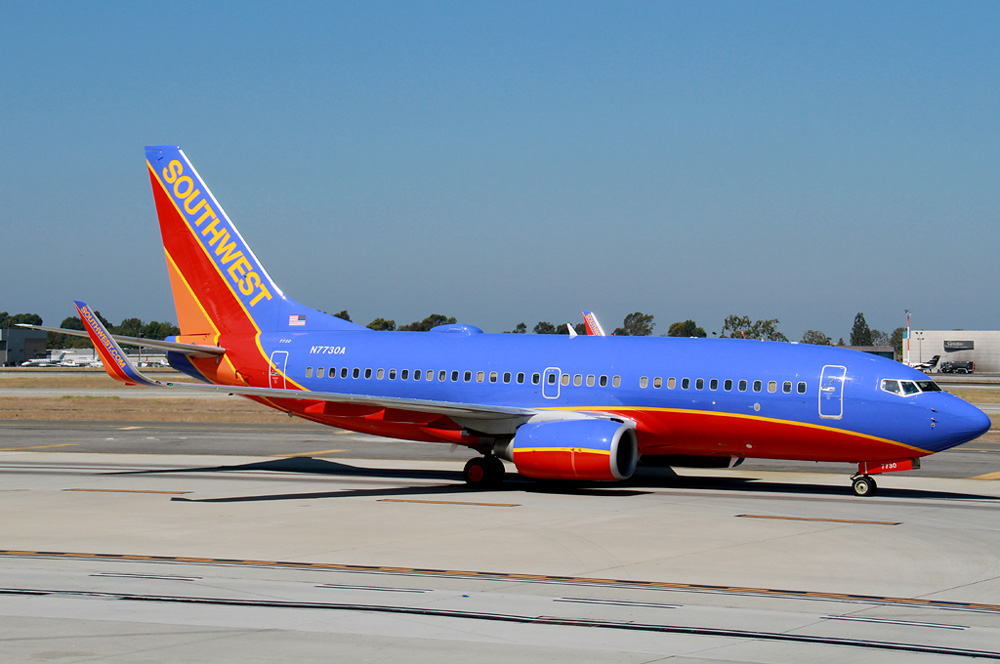 Old livery.
 Southwest Airlines and its partners did comprehensive research and held numerous focus groups with Employees and Customers to determine how best to create the new look. The airline heard that it was important to remain unique and to retain its personality; for these reasons, Southwest continues to use the vibrant color palate and striped tail that has long identified the carrier, while adding a modern touch, proudly displaying the Southwest name on the side of the fuselage and presenting the Heart on the aircraft belly. Southwest has had several different liveries and logos throughout its 43-year history; remaining current and relevant is critical to the sustainability and future growth of the brand.
Southwest press release
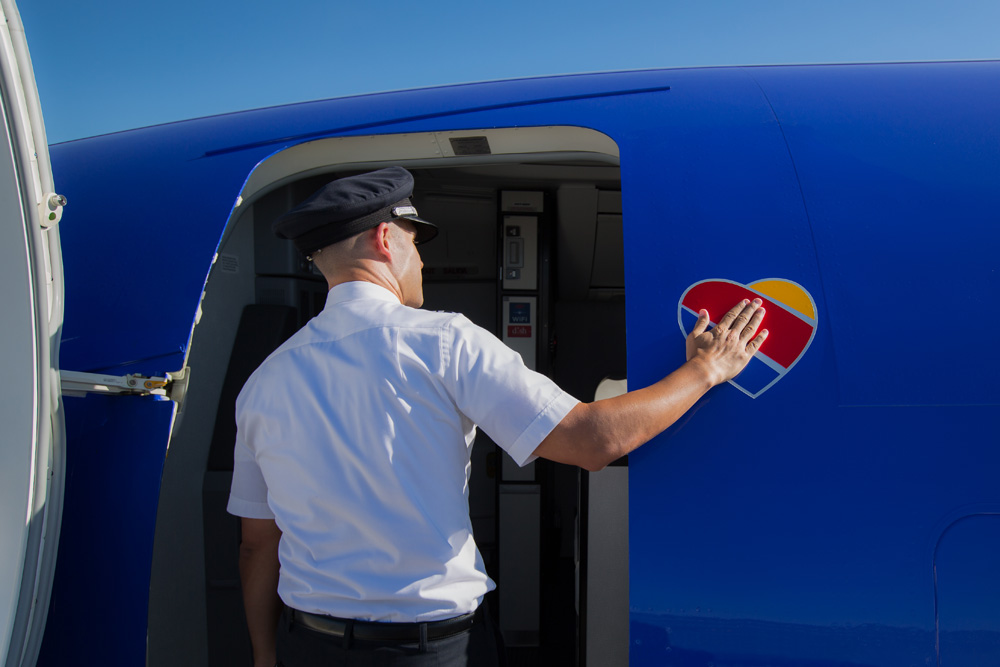
Painting the new livery.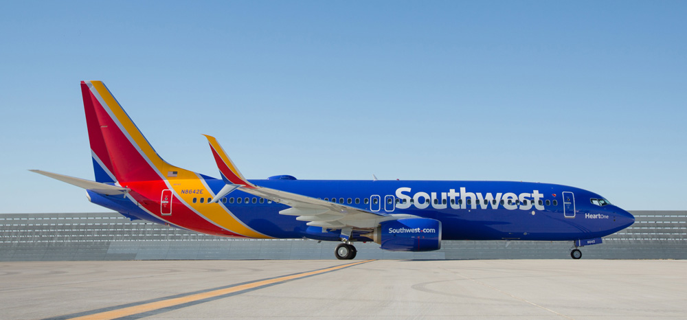 New livery.
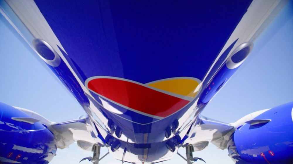
 A couple of sexy livery detail shots. You can see plenty more here.
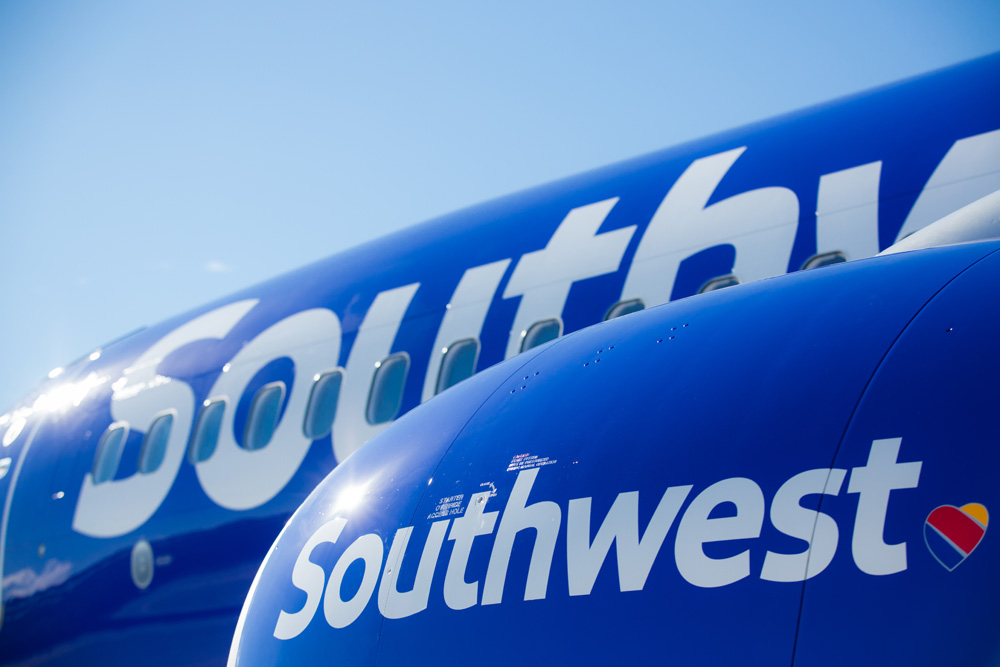
 There were some rumors that Southwest would be getting rid of its heavily painted livery, which makes for really high paint job costs but Southwest clearly realized that their planes are some of the most recognizable from the ground, with their giant red bellies and have decided to continue dropping buckets of paint unto them. The old livery was fine but this new one is absolutely stunning — maybe it's simply the fact that it's literally a fresh coat of paint and the one plane that's been painted looks as bright as it will ever be. Nicknamed "Heart One", the new livery features the new wordmark large across the fuselage and the heart icon on the belly, making the planes even more identifiable.
 New ticketing counter look.
 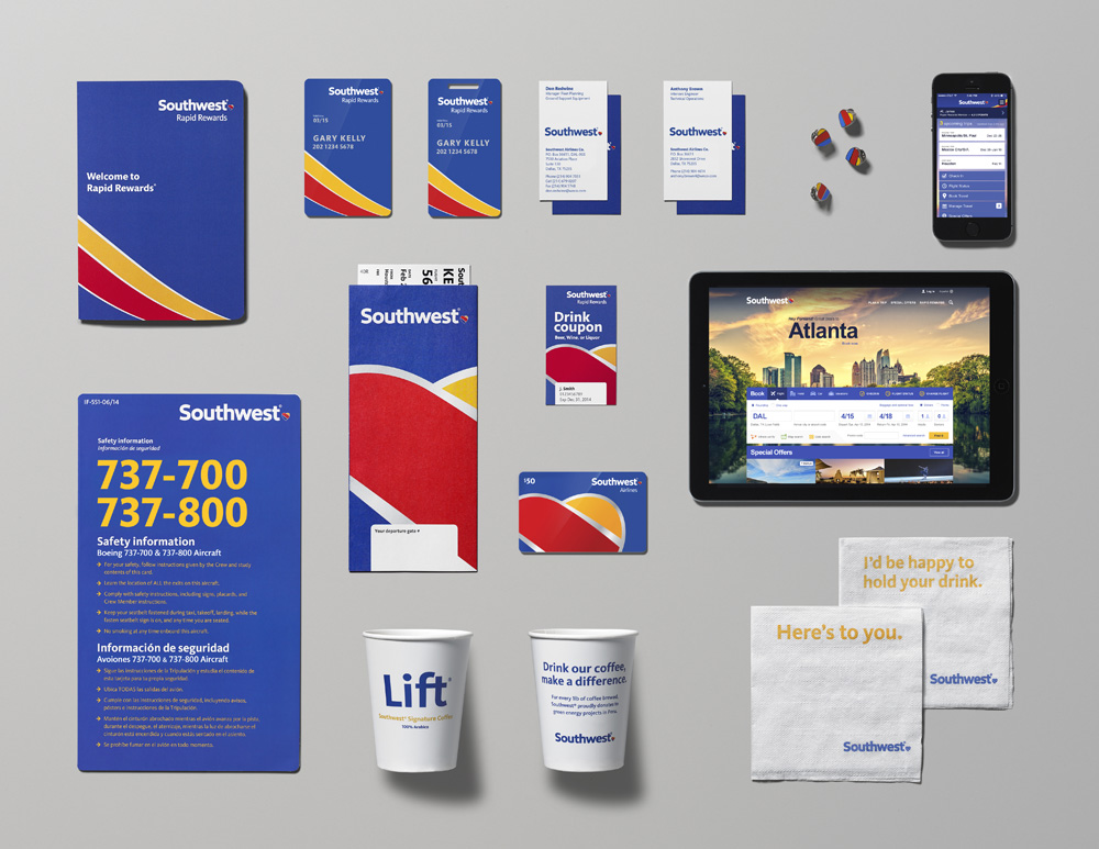 Print materials.
 Not much to say about this: looks sharp, clean, and colorful. I like how they are blowing up and cropping the heart in some of the print applications.

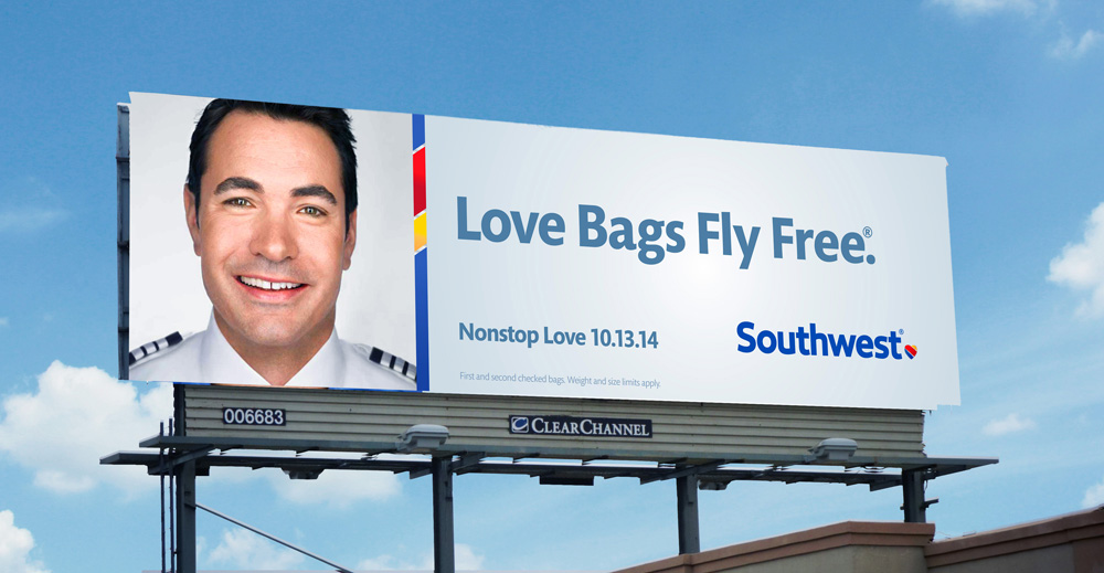 Sample advertising.
TV spot.
Sample advertising.
TV spot. The advertising so far is okay. The introductory TV spot, with the catchy message of "Without a heart, it's just a machine" is quite nice. The print ads… meh. Trying a little too hard.
The new "DING" mnemonic.I used to really like the old "DING – You are now free to move about the country" mnemonic but the updated, minimalist version is also quite catchy, although then I start thinking about The Clapper.
 Cute.
Cute. Overall, I think this is one of the best airline redesigns we've seen in many years. There is a clear pride in it from Southwest, given all the materials they've made available and how they talk about it. It's almost rare for a company to have this much confidence in a rebranding launch. The heart is no Pan-Am globe, or Lufthansa crane but — because the competition has been so weak and timid about putting forth any identity with any real story to tell or message to convey — I'll bet you it will become one of the most recognized airline logos in the next ten years.