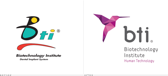
Established in the 1980s (sorry couldn't find an exact date), BTI (Biotechnology Institute) is a Spanish company that designs and produces implants, prosthetics, and surgical instruments for the dental industry. They also specialize in tissue regeneration procedures. Based in northern Spain, BTI has offices across the world. This month, BTI introduced a new identity designed by Madrid, Spain-based Coleman CBX.
Coleman CBX chosen as a symbol of the new brand in an intelligent and distinctive, while friendly and beautiful: the hummingbird. A small and efficient unique bird, distinguished and rare — rare in the sense of unusual and — and the best example of precision existing in nature. The hummingbird also has unique attributes, such as the ability to fly backwards, or the speed at which flaps its wings to remain static in the air, making it a display of living technology.
Inspired by this reference, Coleman CBX developed the three-dimensional picture of a hummingbird that is origami-textured, intelligent, scientific, modular and scalable. A symbol was the work of nature but also in engineering. As a final touch, Coleman CBX chose an unusual color range in the sector: mauve, purple and pink colors transition from the warmth of the magenta and blue technology.
— Press Release, Google Translated

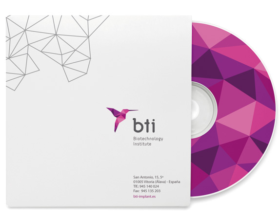
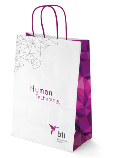
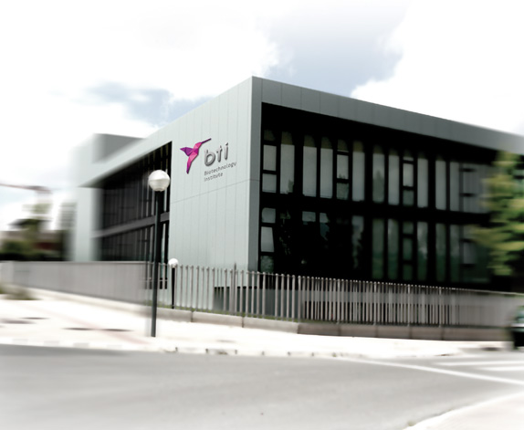
Ohmygod with that old logo! Hard to believe a serious company would ever use such a thing. It's like a logo for a fake tourist attraction in Barcelona. Clearly, it had to go. The new logo is infinitely better and adequate for a technology company. The hummingbird icon is nicely done and the origami-esque texture — which I see more as fractals then origami — gives it a slight edge, avoiding it look too cute. The typography is fine, nothing too absurdly techie but nothing too simple either. Interesting that it has the same flavor of the recently reviewed FADU; must be a European thing. The rest of the identity is exactly what you might expect: plenty of white, clinical space with dashes of the fractal texture. It's all nice but nothing that I feel we haven't seen before. Overall, however, a major and much needed positive transformation.


Don't forget to cast your vote about this post online
